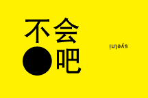
Rule on hipster cafe logos:
Colour: Black
Font: Orator
Plus, have a cross somewhere in the design encased in a circle so it looks like a a billion other hipster cafe logos with crosses somewhere in the design. Encased in a circle.
Powered by Blogger.
September 2014
Making logos
Heroes of Might and Magic 2
Okaaaaayyy... I finally got HoMM2 working on my computer. NO. WAY.
All those memories. All those sleepless nights waking up at 2am to sneakily play this beast on my dad's Win 95 com. So many memories! Heroes 2 is my very first real experience in playing a proper computer game. Even first-er than Red Alert Command & Conquer (of which I'm still trying my hardest to find a version that will install well on Windows 7) And, oh man. Words cannot describe the intense nostalgia this game brings me. What year did it come out? 1996? That's when my age was still a single digit!
Look at the world map screen. Look to the right menu bar. They used a FLOPPY DISK to indicate the save button. A. FLOPPY. DISK.
 |
| Wizard in da house! |
 |
| Hero stats with only 5 army slots. Man, they were stingy with the slots. |
About
Never play with fire. Never rush the queue. Never try to staple your fingers thinking you you can get the bullets to slide past your digits. It won't.
Copyright ©
不 • 会 • 吧
Subscribe


